

Drink It or Display It? The Champagne’s Art Problem
I did warn you: I like art, and it tends to find its way into my wine and food writing. In my world, there’s no hard line between the two. A dish can read like a composition, a bottle like sculpture, and a Champagne aisle can easily start to feel like a gallery.
Plus de Bulles - La Cave - Le spécialiste du Champagne, Reims, France
So here I am, standing in a wine store, staring at a wall of Champagne bottles.
At first, it’s exactly what you’d expect: gold foil, clean labels, celebration vibe. Then one bottle breaks the pattern. Not because of the house per se, but because it looks like it wandered in from an art exhibition. Suddenly, I’m not shopping anymore, I’m curating.
I pick it up, turn it over, study the label like I have authority on the subject… then check the price.
And my brain goes, in that exact order:
I like this.
I am not financially irresponsible enough to buy it.
Where is the crémant?!?
Once Champagne starts to look like an art piece, opening it can feel a bit theatrical.
You almost hesitate: do you actually drink it, or just leave it on display?
To be fair, the classic bottles are still doing exactly what they’re meant to do: consistent, well-made, quietly excellent. But they’re not what stops you in your tracks anymore. It’s the limited editions, the collaborations, the design-driven releases, the bottles that come with a story attached.
That’s the real shift. Champagne isn’t just about what’s in the glass anymore.
Over the past couple of decades, the grandes maisons have steadily nudged it into a different space: part beverage, part design object, part cultural marker. The bottle isn’t just a container now; it’s part of the appeal.
And to be clear, this didn’t happen overnight. Champagne has always lived at the intersection of craftsmanship, branding, and status.
So it’s worth stepping back for a moment to see how Champagne and art ended up so closely linked.
Ruinart

Alphonse Mucha (1896)
During the Belle Époque - roughly the late 1890s into the early 1900s - Alphonse Mucha helped change what Champagne advertising could be. If the name isn’t immediately familiar, his style probably is: flowing lines, soft pastel tones, floral detail, and idealized, almost dreamlike women framed by decorative patterns. A Czech-born artist working in Paris, Mucha became one of the defining figures of Art Nouveau, blurring the line between commercial design and fine art.
His work with major houses like Ruinart, Moët & Chandon, and Heidsieck & Co. turned simple posters and labels into something people actually wanted to keep. These weren’t just ads anymore, they were collectible pieces, instantly recognizable for their elegance and detail.
And Champagne was only part of it. Mucha applied the same approach to everything from biscuits for Lefèvre-Utile to breweries, mineral waters, jewellery, perfume, and fashion houses in Paris. Across all of it, the idea was consistent: take an everyday product and present it with the care and beauty of fine art.
In that sense, Ruinart was ahead of its time. Long before “art collaborations” became a marketing strategy, the house was already experimenting with the idea. One of the earliest and most defining moments came in 1896, when André Ruinart commissioned Mucha after seeing his work for Sarah Bernhardt.
The result was a striking poster: an elegant woman raising a glass of Champagne, rendered in Mucha’s signature Art Nouveau style. It didn’t feel like a traditional advertisement. It felt considered, almost timeless.
And it worked. The image didn’t just promote the wine. It helped shape how the brand was seen, tying it to the flowing, organic aesthetic of Art Nouveau and setting a precedent for how closely Champagne and art could be linked.
And they never really stopped. Fast forward to today, and that same instinct shows up in projects like their Carte Blanche collaborations, where artists reinterpret the brand in their own way.
Launched in 2008, is an annual art commission that invites contemporary artists to spend time immersed in the house’s heritage, vineyards, and historic cellars in Reims. From that experience, they create original works that reinterpret Ruinart’s legacy through their own lens, often with a strong focus on nature, sustainability, and the evolving relationship between art and the environment.
Credit: Ruinart
Ruinart in Reims is an absolute must-visit if you’re in Champagne. The experience feels effortlessly luxurious, from the breathtaking UNESCO-listed chalk cellars to the beautifully guided tastings.
It’s polished, intimate, and a little indulgent, in the best way. Yes, it’s on the pricier side and you need to book ahead, but it’s one of those visits that genuinely feels worth it, more like stepping into a calm, refined world than just doing a tasting.
4 Rue des Crayères, 51100 Reims, France | www.ruinart.com
Moët & Chandon
In 1899, Moët & Chandon were also commissioning Alphonse Mucha to create advertising pieces, like Dry Imperial and White Star, with those signature flowing figures that ended up defining a whole visual era. Today, those posters aren’t just ads, they’re collectibles in their own right.
Fast forward to today, and that same instinct shows up in a much more contemporary way. Moët & Chandon teamed up with Daniel Arsham on Collection Impériale Création No. 1, leaning right into his “fictional archaeology” approach, where modern objects are reimagined as if they’ve been unearthed from the future.
The goal was to take Cellar Master Benoît Gouez’s vision of haute œnologie and turn it into something you can actually hold, something sculptural with a slightly surreal feel. The result is a run of 85 limited “time capsule” pieces that work as both packaging and artwork, cast in chalky white resin with soft erosion details that nod to the region’s soils and historic cellars. Clean, a bit eerie, very deliberate—and priced accordingly, at roughly $37,000–$42,000 CAD per piece.
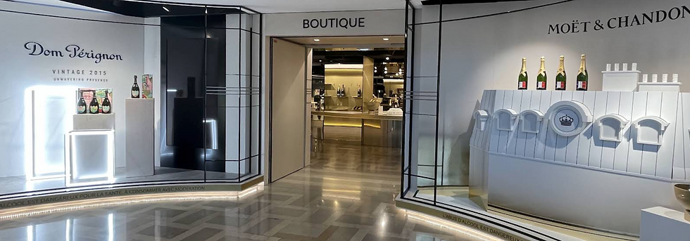
Moët & Chandon’s historic cellars, which also house Dom Pérignon under the same LVMH umbrella is located 20 Av. de Champagne, 51200 Épernay, France | www.moet.com
Perrier-Jouët
Émile Gallé
Perrier-Jouët has maintained a steady dialogue with artists since its 1902 collaboration with Émile Gallé, an Art Nouveau pioneer best known for his revolutionary work in glassmaking. He is also behind the iconic anemone motif that still defines the house’s Belle Époque cuvée today.
Credit: www.perrier-jouët.com
Over the years, it’s commissioned work from a mix of established names and emerging talents, including Daniel Arsham, Noé Duchaufour-Lawrance, Miguel Chevalier, Makoto Azuma, Tord Boontje, Studio Glithero, and Simon Heijdens, Vik Muniz, mischer’traxler, Ritsue Mishima, Andrew Kudless, Luftwerk and Garance Vallée. Each adding their own layer without losing the original spirit: the Gallé anemone is always there, just reinterpreted rather than replaced. The result feels less like a series of flashy collaborations and more like a slow evolution: Champagne not as a party prop, but as something closer to a meditation on nature that just happens to come with very good bubbles.
Champagne Perrier-Jouët’s visitor centre, Maison Belle Époque, is one of the most enchanting places you can visit in Champagne. Set in a historic 18th-century house in Épernay, it combines Art Nouveau interiors, private art collections, cellar tours, and curated tastings, offering an immersive experience where Champagne, art, and nature come together.
26 Av. de Champagne, 51200 Épernay, France | www.perrier-jouet.com
Taittinger
Since 1983, Taittinger has treated its vintage bottles less like packaging and more like canvases. Thirteen contemporary artists have been invited to reimagine the house’s prestige cuvées, turning each bottle into a collectible piece of art, part gallery, part champagne.
The Taittinger Art Collection Brut Millésimé

The bottle itself becomes both canvas and muse, with each edition signed by a different artist.


It began in 1983 with Hungarian-French artist Victor Vasarely, who reimagined the 1978 vintage with optical illusion and gold-toned design. As a fellow Hungarian, I’ll admit: it’s satisfying to see your country open the Champagne art party. Vasarely was a key figure in Op Art (Optical Art), a movement that emerged in the 1960s built on precise, often mathematical patterns designed to create the illusion of movement and visual distortion.
Since then, the series has included global names like Arman, André Masson, Vieira da Silva, Hans Hartung, Toshimitsu Imai, Corneille, Matta, Zao Wou-Ki, Robert Rauschenberg, Amadou Sow, and Sebastião, each leaving a distinct visual signature on the bottle.
From pop art dots to abstract landscapes and striking wildlife photography, every edition reflects a different way of seeing the world. Together, they form a travelling collection of contemporary art, one that you don’t hang on a wall, but open and share.

I particularly like the Roy Lichtenstein pieces in the Taittinger Collection (1990). He takes his comic-book style and pushes it into Champagne, using bold dots, sharp lines, and a tight palette of yellow, blue, and green that hits instantly.
But it’s not just graphic flair. He stretches and distorts the imagery until it almost feels like it’s slipping out of focus, which gives it this strange, energetic tension. Underneath it all, the flowing forms quietly hint at vines and growth, nature tangled with human craft, which, in a way, is exactly what Champagne is.

Taittinger’s headquarters in Reims feel like visiting a museum: the art collection bottles are displayed in glass cubes as precious artifacts, as they should be. The entire experience is less about a traditional winery visit and more about walking through a curated cultural space.
A highlight of the visit is the 45-minute tour of the Roman-era chalk cellars (crayères), carved 20 metres underground, which add another layer of history to the experience.
9 Place Saint-Nicaise, 51100 Reims, France www.taittinger.com
Dom Pérignon
Dom Pérignon is the prestige, vintage-only Champagne produced by the renowned house Moët & Chandon, under the LVMH group. The name pays tribute to the Benedictine monk Dom Pierre Pérignon, often credited as an early quality pioneer in Champagne in the 17th century.
Takashi Murakami (2025)
Fast forward a few centuries, and Dom Pérignon is now as known for its collaborations as for what’s inside the bottle. Its 2025 holiday release with Takashi Murakami is a perfect example, bringing his instantly recognisable smiling flowers onto vintage cuvées. The result is playful, slightly surreal, and impossible to miss whether it’s on a table or a shelf.
And yes, this is the bottle that kicked off the whole article. So, fair warning, you can blame Murakami for that.
The collaboration comes in two expressions:
Dom Pérignon Vintage 2015: bright and expressive, with notes of roasted cocoa, lime blossom, and citrus zest. A more youthful, open style of vintage.
Dom Pérignon Rosé Vintage 2010: deeper and more complex, with raspberry and blood orange notes. Bold, structured, and made in a challenging year for Pinot Noir, which makes its precision all the more impressive.
Murakami describes the project as a kind of time travel:
“Through my collaboration with Dom Pérignon, I wanted to express a form of time travel… I hope that people of the future, when they see it, will reimagine 2025 in their own minds”.
It’s a nice idea, but Murakami is also very good at the other side of the equation: staying relevant.
Born in Tokyo in 1962, he trained in traditional Japanese painting, came up through animation, and then built his own visual language that fuses classical techniques with postwar pop culture. Bright colours, smiling flowers, and just enough edge to make you look twice.
His “Superflat” theory (flattening the divide between high and low culture) helped define that approach. And he’s backed it up in practice, moving comfortably between galleries, fashion, and commercial work, from collaborations with Louis Vuitton to projects with Kanye West, all while running his studio Kaikai Kiki like a creative enterprise rather than a traditional art practice.
Andy Warhol Tribute (2010)
This kind of crossover isn’t new for Dom Pérignon, which has long engaged with the art world. In 2010, they released the Andy Warhol Tribute Collection, giving their classic labels the full pop-art treatment: bright colours, bold vibes, and just enough attitude to make your wine rack feel underdressed. Six colour variations, each with a matching box, turned a bottle of Champagne into something suspiciously close to a collectible set.
Jeff Koons (2013)
Then there’s the Jeff Koons “Balloon Venus” for Dom Pérignon (2013), which is exactly as over-the-top as it sounds. He took a 25,000-year-old fertility figure and turned it into a glossy, balloon-like sculpture that opens up to reveal a bottle of rosé.

Only 650 were made, so it lives in that weird space between art piece, collector’s item, and very expensive conversation starter. When it launched, the magenta version was around $27,000 CAD, with custom ones pushing closer to $34,000 CAD. And at that point, let’s be honest, you’re not cracking that open on a random Tuesday.
You’re either saving it for a once-in-a-lifetime moment, or quietly treating it like an investment with better packaging.
Jean-Michel Basquiat Tribute (2024)
And they didn’t stop there. The more recent Jean-Michel Basquiat Tribute edition leans into the same idea, pulling from a 1983 painting and splitting the design across three boxes that only really make sense once you line them up. The bottle itself merges Dom Pérignon’s shield with Basquiat’s crown, a neat little signal that what you’re holding is part wine, part artwork.
It’s a limited-edition release of the Vintage 2015, launched in late 2024, and it nods to Basquiat’s “art of assemblage”: layered, fragmented, a bit chaotic, but very intentional. Which, conveniently, also describes how this whole Champagne-meets-art thing feels now.
Veuve Clicquot
Veuve Clicquot had also stepped into the art world with its own collaboration back in 2012.
Yayoi Kusama (2012)
They partnered with Yayoi Kusama, which, if you know her work, means one thing: polka dots. Lots of them. Kusama is one of Japan’s most important contemporary artists, famous for her immersive Infinity Mirror Rooms and those unmistakable dots. Now in her 90s, she’s also the world’s top-selling female artist, known for transforming her personal hallucinations into mesmerizing installations seen across the globe.
The result? A limited-edition La Grande Dame 2012, created as a tribute to Madame Clicquot herself, the original "Grande Dame of Champagne".
It’s a pretty perfect pairing. On one side, a woman who reshaped Champagne in the 19th century, and the wine - a Pinot Noir–dominant blend showcasing the house’s prestige and excellence; on the other, an artist who’s spent decades reshaping how we see the world. Kusama’s polka dots echo champagne bubbles and optimism, while a bold floral sculpture wraps the bottle in a burst of energy and nature-inspired flair. Packaging ranged from a custom gift box to a very rare oversized floral sculpture case.
Other recent notable collaborations include:

Paola Paronetto (2023-2024)
Italian ceramicist Paola Paronetto partnered with Veuve Clicquot on sustainable gift packaging for the 2015 La Grande Dame vintage, designed in six custom hues inspired by light, contrast, and form. Known for her Giganti Monumentali - large-scale sculptural bottle works that can exceed a metre in height—her practice blends clay and cellulose fibres into textured, paper-like ceramics. The result is a body of work that sits somewhere between object and sculpture, with a strong focus on colour, tactility, and organic rhythm.

Yinka Ilori (2026) collaborated with Veuve Clicquot on the Chasing the Sun collection, unveiled at Milan Design Week. The project translates his bold, joyful visual language into Champagne accessories - colourful ice buckets, portable coolers, and a customizable “Clicquot Arrow” box that maps the distance between your city and Reims. Made with sustainable materials and rich symbolism, the pieces focus on warmth, connection, and celebration, released in limited quantities through select luxury retailers.
Veuve Clicquot’s signature Pantone 137C orange-yellow is a rare example of a colour becoming a true luxury asset. Instantly recognizable on shelves, legally protected, and strongly associated with its "solaire" identity of optimism, warmth, and modern elegance. First introduced in the 19th century, it now functions as a powerful visual shortcut for quality, standing out in crowded retail spaces and extending across lifestyle collaborations, packaging, and events.
A visit to the Veuve Clicquot Ponsardin Visitors Center in Reims is often described as a refreshing experience for both palate and soul.
1 Rue Albert Thomas, 51100 Reims | www.veuveclicquot.com

Pol Roger
Worth a quick footnote mention: Pol Roger’s long-standing friendship with Winston Churchill adds its own cultural layer to the story. Churchill was not only a devoted Champagne drinker but also an avid painter, and that creative side is often reflected in the house’s identity.
His final painting, The Goldfish Pool at Chartwell (1962), is frequently referenced in tributes connected to the Cuvée Sir Winston Churchill, the prestige cuvée created in his honour, rather than appearing directly on the bottle itself.
Beyond Champagne
Art and alcohol have been quietly collaborating for decades, and not just in Champagne. Across wine, spirits, and collectible bottles, some of the world’s most respected producers have turned labels and packaging into canvases.
One of the most iconic examples is the Château Mouton Rothschild Artist Label Series, where since 1945 a different major artist has been invited each year to design the label for a new vintage. Over time, this has included some of the most influential names in modern art, meaning a bottle in your cellar might quite literally carry a piece of art history on its face.

The historical roster is just as wild: Andy Warhol, Pablo Picasso, Salvador Dalí and the very first label in 1945 kicked things off with a “Victory” design marking the end of WWII.
There are a few quirky rules to the whole thing. Artists aren’t paid in cash; instead, they get wine. Ten cases, including bottles of their own vintage plus a few from the cellar of their choice. The family selects artists based on global reputation and a bit of personal taste, and while themes like vines, wine, or the iconic ram may be suggested, the artists are basically told: go on, do what you want.
If you’re ever in Pauillac, you can see the original works on display at the château itself.
Château Mouton Rothschild artist-label bottles sit at the meeting point of fine wine and collectible art, where value depends as much on the featured artist and cultural impact as on the vintage itself. Most modern releases range from about $700 to $1,500 CAD, while rare historic vintages and iconic artist editions can climb into the thousands or even tens of thousands. The market also extends beyond bottles to labels and full sets, with prices often jumping after new artist announcements due to strong collector demand and speculation.
Beyond Art
Champagne house collaborations don’t start and stop with art. Many of the same houses featured here also work far beyond the gallery space.

For example, Bollinger has long been tied to film through its iconic partnership with the James Bond franchise. James Bond famously orders Bollinger on screen, making it a symbol of cinematic luxury
since the 1979 film Moonraker.
Moët & Chandon has collaborated across fashion, music, and entertainment, including partnerships with Pharrell Williams, positioning Champagne firmly within pop culture rather than tradition.

Dom Pérignon has leaned heavily into music and celebrity culture, working with artists like Lady Gaga (2021–2023), Lenny Kravitz (2018–2020), who also stepped in as creative director and shaped special edition bottles and campaign visuals, and Anderson .Paak, featured in the 2025 “Creation is an Eternal Journey” campaign as musician, producer, and director.
The brand has also brought in more unexpected creative voices, like Iggy Pop, who appears in the same 2025 campaign, while Björk collaborated with Dom Pérignon back in 2015 on a series of artistic projects that pushed the boundaries between Champagne and contemporary art.
Fashion also plays a wider role in this ecosystem.
Veuve Clicquot has partnered with designers like Simon Porte Jacquemus (2025), pushing the brand further into fashion-led storytelling.
The French designer brought a distinctly fashion-forward lens to La Grande Dame 2018, wrapping the bottle in white linen with yellow stitching - very South of France, very runway. The launch event, “Le Pique-Nique sur L’Eau” in Central Park, leaned fully into spectacle, with boats, colour, and a carefully staged sense of summer celebration.

The experience has since extended beyond the campaign itself into physical, fashion-adjacent merchandise, including a collaboration with Vilebrequin, offering items like swimwear, hats, and beach accessories that move the brand further into lifestyle territory. Also Stella McCartney, working within the broader LVMH universe, reflect the shift toward cross-industry branding, where fashion, sustainability, and lifestyle increasingly shape how luxury is perceived.
Beyond art and music, sport is another key space. Champagne has long featured in Formula 1 podium celebrations, where brands like Moët & Chandon and Veuve Clicquot are tied to victory and elite sporting imagery.
Taken together, these collaborations show a clear pattern: Champagne houses are no longer speaking only to traditional luxury audiences. They are reaching into film, music, fashion, and sport to stay culturally relevant, somewhere between heritage and pop culture, but always following attention and money.
That said, for us mortals, even if it’s just for a special occasion or New Year’s Eve, we still end up buying that bottle of Champagne… because, well, we only live once.
So What Are We Actually Buying?

You’re back in front of that shelf, doing the math.
Do you drink it, or display it?
Champagne was never meant to last. That’s the whole point. But some of these bottles clearly weren’t designed to disappear.
And that’s when it stops being a simple purchase and starts feeling like a decision.
Am I buying Champagne, or am I buying art?
Honestly, it’s both, just not in equal parts.
The wine still matters, of course. But if we’re being real, it’s the label, the collaboration, the story around the bottle that pulls you in. That’s what makes you linger longer than planned, start justifying the price, and seriously consider something you had no intention of buying five minutes ago.
And yes, I keep saying "we" and "I", as if this is a shared experience. It isn’t, really. This world belongs to people who don’t flinch at those numbers. The rest of us are just observing from a safe, respectful distance.
Because sometimes a bottle is just a bottle. But sometimes it turns into a conversation piece, a collector’s item or something that sits unopened on a shelf, quietly reminding you of your financial decisions.
Either way, it’s doing exactly what it was designed to do.
And then there’s the real question at the end of it all: where’s the Champagne that doesn’t come with a concept, a collaboration, or a story, just a classic bottle with a shiny label and no narrative attached?
(Checks bank account.)
Or more honestly… where’s the Crémant, Cava, or Prosecco when you actually need it?
Cheers 🥂


Comments